We have carried out initial collaborations between the Manchester and STFC researchers within CCPi in the UK; with Kitware Inc in the USA. My presentation, on early part of this software collaboration, between UK- USA with poster and presentation, is on zenodo.

In our funded work both sides met and are considering research software for 3D volume reconstruction and quantitative visualisation; with a similar (possibly in the future interchangeable) python based pipelines.

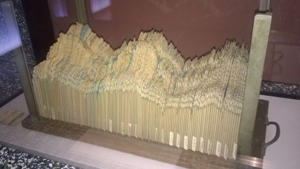
There were two workshop in the last month on what I would refer to as discovering ‘quality’ software through collaboration: an EPSRC SSI meeting at MOSI (Museum of Science and Industry; 24 April 2018 – image above) and then a round table discussion with the CoSeC developers at STFC (Scientific Technology and Facilities Council; 30 April to 1 May 2018).
These meetings will report back on these factors that the development communities think are important; which for ‘quality’ software is not necessarily the same as the needs of the science or the funders. A few comments and question arose that we will think about in terms of future software collaboration activities.
“Be Intuitive and Be Brave”, C. Goble requested of the funding bodies – but this can be useful campaign call across the divide. There is a divide between the science vs the talent that created the tools.
- How to value this software creation activity – when it possibly involves not just multiple organisations but multiple countries – where the sponsors/funders are only based in one part and may only think in one way.
- Credits for software should be more like movie credits – so a career path rising up the specialisms until full recognition as a ‘director’ – then possibly we can have the Oscars for research software development.
- In some sense this indicates how the process often involving a large cast of stars and support staff.
- Long term life-cycle and sustainability is to be considered; with the issue that good software is 20+ years to implement and maintain: should quality equate to longevity.
- A common aim is to make code – and the theory of code – that is useful or essential! then the term quality code can easily be applied.
- If you have quality code, or not, when to do a major rewrite of the sw and how then can its status be maintained (or improved).
- Essential is a testing strategy: a national Jenkins service is still being maintained with identity management carried out through Anvil (shib access)
To Github or To Not Github
An aside on code repository as this was an ongoing discussion since the EPSRC announced that the repository ccpforge is closing down. Alternatives need to be found. There are lots of options and in the UK we are likely not to have a cohesive national service for a period, but we need a code repository. A key choice for individual projects is to either build and use a local service – say one based at the university of Manchester or one based in SCD at STFC; where you have to have a person responsible for maintenance and identity management etc – or to use an international service say from gitlab or bitbucket and then if you wish to pay for this and to what level. So taking notes of comments:
- Paying for gitlab or bitbucket – annual fee, or monthly usage fee – say a few hundred pounds; is a popular option and is minimal in cost as long as there is a small number of developers and only a few private projects requested.
- Using mirror site etc is also popular but that does not use all the facilities and just keeps location – this is important possibly for branding issues and helping code to be found.
- Issues of branding and identity – means that a local service can have very tight control of branding but at a cost of having to renew and update software. International services may removing or change rights, permissions for local branding (and worse – advertisement etc) so diluting identity and searchability of the code.
Ongoing debate and reports should be made in the near future to guide the UK community; and we have ongoing opportunities to increase UK-USA and UK-EU collaborations – grants to be written.
MT


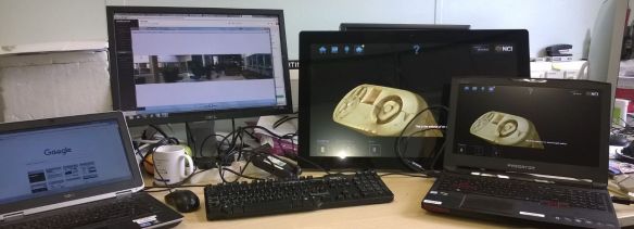 Moving this to the exhibition area within the NGI (National Graphine Institute) with a HDMI splitter should then be suitable for 100’s of viewers per hour …