MSc Project Proposal #2

Identifying differences between very similar images

Background

Identifying changes between two successive images is a necessary pre-condition of following change, and its significance. JMW Turner 1775-1851 (voted Britain’s most popular artist) produced upwards of 900 prints in his lifetime.  One of the reasons for his reputation was his obsessive attention to refining the details of his prints.  As a result, he and his engravers produced a succession of working proofs (states) for each print before it was published and a succession of different (usually deteriorating) versions for sale.  Identifying these changes has, and is, traditionally done by placing two impressions of the print side by side, then looking for differences line by (microscopic) line.  But that is really difficult to arrange when the pieces of paper are scattered across the world in institutional and private collections.  Using the rapidly improving digital image analysis can provide a method of automatic comparison.

There are a number of difficulties.  The process of making an impression from a metal plate involves humidifying the paper to ease the transfer of ink, then drying the impression, resulting in differential swelling and shrinkage which is different between different printings, papers and subsequent environmental conditions.  Since their printing, many impressions have undergone mechanical damage, staining, or modification such as colouring. This makes comparisons somewhat more difficult.  A trained human eye can learn to discount these distortions to follow individual features.

A first try at this problem by Anja le Blanc, see https://studiorum.itservices.manchester.ac.uk/print-comparisons/, used the strategy of aligning the two images using significant features on the images, such as a frame line and omitting the colour changes in the paper. Then cutting the images into 20 pixel squares and realigning using an average of the visible feature. Then identifying the lines/features in common. Then identifying and displaying the lines present/absent in one or the other image.  This process was repeated in successive squares to cover the entire image.  This was an excellent proof of concept, but threw up a number of problems.  The major one is the difficulty of achieving good, i.e. perfect, alignment of the original printed lines in each square. The second one is ensuring that there is no mis-alignment between adjacent squares, which results from the initial alignment, and necessary distortion to align, of the initial images.

Deliverables

There are a number of requirements which require interim deliverables.  The following is one suggested strategy, but the student may well come up with a better one.

  1. Identifying the features common to both images then placing them on a standardised grid. These features probably include every common printed line and point.  In general, there are about 6 different “states” known for each print during development.  So this standardised grid should be reusable, and refinable, for future comparisons.
  2. Normalising the images so that all the printed features have the same (or comparable) contrast with the background paper.  Both the colour of the paper and the intensity of the ink colour can vary considerably, because of variability in the materials used initially and subsequent ageing, wear and tear.  Again for a more general solution, it would be useful for all prints to be normalised to the same standard. 
  3. Overlaying the images on the standardised grid and ensuring the maximum coincidence of features.
  4. Carrying out subtractions to show the features uniquely present and not present in each comparator image.

Reference Example Manipulaitons

High resolution images are available for all these.  It would be useful to re-work the examples shown on the Turner webpages for comparison, These two impressions are nominally the same state, but look very different. Are they?

Reference Example Manipulations

High resolution images are available for all these.  It would be useful to re-work the examples shown on the Turner webpages for comparison,

  1. These two impressions are nominally the same state, but look very different. Are they?

1a.          F008_iv_ad_ad0010_PM

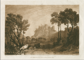
1b. F008_iv_cvh_cvh3339_PM  

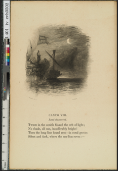
This is a successive sequence of images:  2a. R401_etc_cvh_cvh0140_PM

2b. R401_epa_cvh_cvh0141_PM

2c. R401_epb_cvh_cvh0142_PM

2d. R401_epc_cvh_cvh0143_PM

2e. R401_i_hg_hg0698_PM

2f. R401_iia_cvh_cvh2279_PM

2g. R401_iib_cvh_cvh0560_PM

2h. R401_iii_cvh_cvh2220_stitched

2i. R401_iv_cvh_cvh0502

Advertisement

MSc Project proposal

Stitching photographic images – eliminating errors in stitching.

Background

Stitching a series of image tiles captured in a mosaic into a coherent image is a frequent requirement in photogrammetry, mapping, etc. Current software packages appear to use a common methodology of bottom up matching patterns, by simplifying the image on each tile, merging these images, then filling in the details from the original tiles.  However and increasingly, the tile images are captured across a tightly controlled imaging network, so the positional relationship between the edges, or overlaps, of the tiles are available.  The standard method of stitching largely ignores both these interfaces and the internal structure of each tile.  As a result, confusing tiles result in misaligned and distorted mosaics (fig.1) which are not tested and corrected against the detail in the original tiles. Researchers currently have considerable difficulty in finding a methodology that will reliably stitch such data sets.

In many fields (Google Maps is the most obvious application), high resolution images are readily obtained for small areas of the object of interest.  For use, these tiles must be stitched to create a wider field image at the same resolution and without loss or distortion of the detail captured.  This current project is part of the creation of an online catalogue of JMW Turner’s C19th prints. The engravers of the time achieved a resolution of line and image that could exceed the resolution of the paper substrate, and has been rarely matched since.  One aim of the project is to provide digital images of each print that match the resolution of the original, which can vary from ca 1200 to ca 3000 dpi.  The prints vary in size from 5×5 to 700×800 cm.

Description

The researchers want a reliable method that does not require many iterations of settings to optimise (but rarely do) the stitching of each image.  There are two basic approaches depending on the type of source data being used.  The creation of panoramas from a fixed camera position requires considerable adjustment, i.e. distortion, to align tiles in the perspective geometry.  This approach has informed and underpinned many available stitching programs. Examples are PTGui  fig. 2 (https://ptgui.com/), Agisoft fig.3 (https://www.agisoft.com/).

However, the scientific community usually starts with a set of images taken from a mesh of camera positions, each with a more or less orthogonal geometry, which might be a microscope slide (https://pages.nist.gov/MIST/ and https://abria.github.io/TeraStitcher/) or the Milky Way (http://montage.ipac.caltech.edu/).  It is proposed that this additional location data is incorporated into the stitching algorithm in order to reduce the tendency of image matching to create false matches.

Because there is usually a considerable overlap between adjacent tiles, there are few places in the overall image that do not contain the true local image.

The preparation of the mosaic needs to have a correction stage where the constructed interfaces can be compared with, and corrected by, the known true image.

Deliverables

A software package to create mosaics from well characterised sets of tiles, with minimal misalignments and distortions.  The required input parameters and data structure should be explicit and readily provided by the person preparing the set of tiles.

A number to training sets can be provided, captured in various ways.

Image Results References:

Fig 1. A cascade of misalignments of horizontal lines, seen on the left and on the far right. This image was prepared with Microsoft Image Composite Editor from a set of 8 scans of a Turner print, each 1.9 GB, R652_i_cvh_cvh3092_PM_stitch.tif. ICE is one of the more reliable stitching programs.

Fig. 2  A more obvious misalignment, similarly the result of MCI, R207_i_cvh3337__stitch.psb

Fig. 3  A typical misplacement of tiles by PTGui, R699_PTGui_frame_stitch.jpg.

Fig.4   A mosaic prepared from a set of tiles using Agisoft. The edges of the rectangular set of tiles were not recognised by the software. R650_etc_cvh0252_AgisoftExportOrthoMosaic

-Image test results from a suite of possible tools: url: 2022 https://visualisationmatters.com/2022/11/03/msc-project-proposal/
-Horie, C. V. (2018), “Turner’s Prints: Reassessment using Digital Tools, leading to an Online Catalogue Raisonne”, Turner Society Newsletter 130 (Autumn 2018), 14-19. URL: http://www.turnersociety.com/magazine/
-Wei LYU and Zhong ZHOU and Lang CHEN and Yi ZHOU “A survey on image and video stitching” Virtual Reality & Intelligent Hardware, Vol 1, number 1, pages 55-83, 2019, issn 2096-5796, doi https://doi.org/10.3724/SP.J.2096-5796.2018.0008, url https://www.sciencedirect.com/science/article/pii/S2096579619300063
-Chen, YS., Chuang, YY. (2016). Natural Image Stitching with the Global Similarity Prior. In: Leibe, B., Matas, J., Sebe, N., Welling, M. (eds) Computer Vision – ECCV 2016. ECCV 2016. Lecture Notes in Computer Science, vol 9909. Springer, Cham. https://doi.org/10.1007/978-3-319-46454-1_12