
Can visualisation methods be evaluated and should they.
A proposal presented at EuroVis 2014 held in the University of Swansea, Wales.
V = -T + I + E + C
This is the Value of a Visualisation is equal to the Time taken to understand the visualisation from the user plus the Insight the user gains from this plus the Essence gained for parts of this plus the Clarity defining the overall acceptance of the global data set by the user.
So let’s try this in action on a simple 3D example with users.
Example 1:
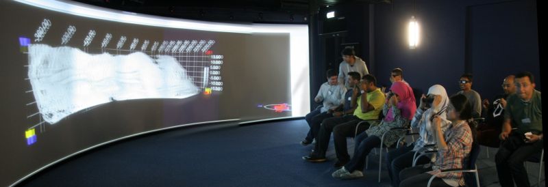
LiDAR visualisation for the geology community – can show rock escarpments and cave structures at myltiple sclaes with augmented meta-data and markers.
The previous image shows a geological structure in Egypt, Mount Sanai in stereoscopic 3D projection mode, with added markers showing way-points, landmarks, measurement fields as well as allowing ares of curvature for example to be highlighted and measured.
The time taken to do a demonstration is very low, and the number of Insight points (sometimes called Impact or Wow elements) is reasonably high as the user can discover anomalies, for example smooth areas of curvature in the rock face showing different strata. The Essence or global structure and understanding is also high as this is an intuitive 3D structure, and from this Confidence or Clarity in the data can be achieved. There are a few outliers and anomalies from the LiDAR data but the visualisation is very clean.
Example 2:

CCP4software demonstration visualisation image – showing switchable components from proteins viewed in stereoscopic mode to an audience.
