Tomographic Imaging of a Nokia 702 Mobile Phone and other Items
The Challenge
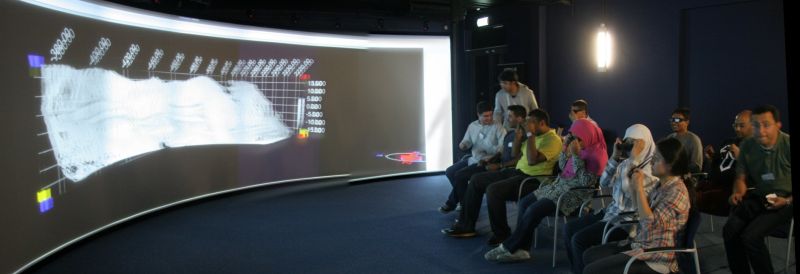
Spot anomalies using the software available. As part of an assignment a set of objects were scanned using an X-Tech 320 kV CT scanner. This was followed by an exploratory stage using the multiple methods available from visualisation systems.
Key items to be discovered included the following:
- Understand how different materials and components can be separated.
- Extract some understanding of the objects to gain insight in to the object’s function
- Extract the shape of a visible or unknown component.
- Analyse the density of the materials used and identify defects.
The Solution
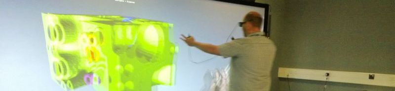
Presented a range of 2D and 3D views that could be manipulated to see features. An ancient mobile phone, the Nokia 702 amongst other items were investigated. About 1500 2kx2k X-ray images were captured over evenly spaced rotation angles of the mobile phone. These were reconstructed to create a 3D volume approx 1500 x 1000 x 1000.
Example 1: Mobile Phone Nokia 702
The speaker mechanism (bottom) can be clearly seen, as well as loose components (right) that were not screwed down properly.
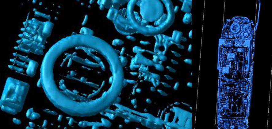
Left: Speaker components clearly visible identifying 3D shape and measurable size and density.
Right: Loose components (extra screw) that has fallen into the phone during assembly is visible and measurable.
The obvious aerial is actually an aesthetic feature, as it is not connected, with a mesh being used instead (below).

Two density transfer functions highlighting the mesh aerial.
Very quick confirmation of discoveries has occurred but the full visualisation component can be seen in the following screenshot that describes and views the raw data, image projections, 3D reconstruction slices and final 3D volume visualisation (left to right).

Mobile Phone being viewed as raw data, image projections, 3D reconstruction and final 3D volume visualisation (Drishti)
Example 2: Golf Balls.
A Fitleist 2 (High-quality) versus a Srixon 4 (standard quality) golf balls; were both scanned at 2kx2k and then investigated using identical networks to discover material characteristics non-destructively. The high-quality golf ball has a very well-defined liquid core with an injection point, multiple tight winding impressions, as well as, far more complex layers of materials all visible and can be quantified in terms of shapen and size.

Example 3: Low Quality Padlock.
A very low quality padlock – with simple mechanism. Although the padlock uses a key the shape has been shown to be irrelevant to opening the lock. All that is needed is for the clip (far right) to be pulled apart so virtually any flat shape will work.
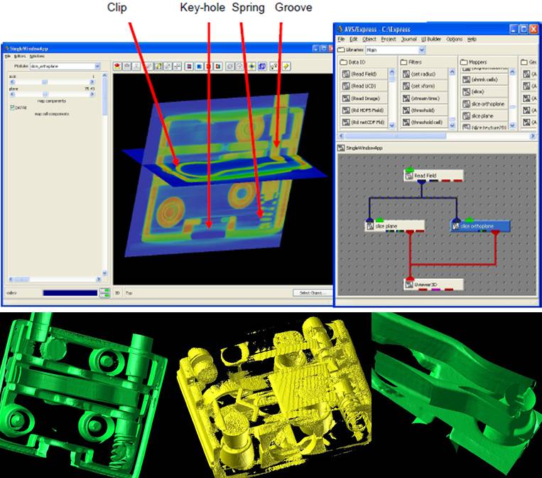
Visualisation network for the low-quality padlock. Although simple can still with interactive exploration discover new features within the volume data set.
Example 4: High Quality Padlock.
A very high quality spherical security padlock – with complex mechanism. Requires a complex key structure, but it is still possible to retrieve the main components of the key shape.

Various views and colourmaps highlighting components within the high-quality padlock; as well as marked up components showing a possible 2D key structure to assist in picking the lock.
Example 5 Homeland Security combination padlock
Homeland Security combination padlock. Understand how both combination and key mechanisms work; 1. Extract the correct combination code for unlocking the padlock, 2. Extract the shape of the key, and 3. Analyse the density of the materials used within the padlock manufacture and identify defects. Visualization filters can extract specific components – in this case recover non-destructively the combination lock values for the padlock. Alternative visualization filters allow analysis and measurement of defects introduced during the manufacturing process.

How to extract the combinations from a padlock. Step-0by-step process extracting and examining the components.
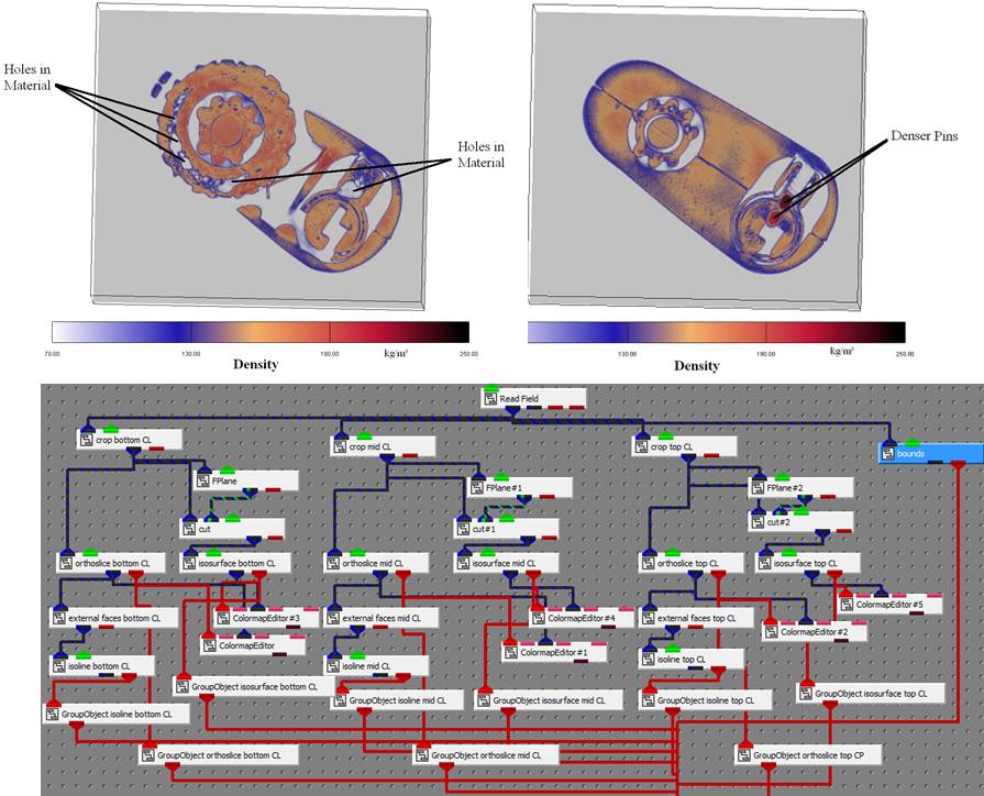
Density measurements illustrating poor and good quality manufacture within the lock. Network is complete network for the extraction of the combinations.
The Benefits
The benefits of using visualisation in this case was to gain Insight as the human was able to see anomalies that an automated computer system could not. The question is when would an automated system – say for defect detection – be sufficient and used and then visualisation is not needed just data analysis and mining.
Credit to the students and researchers in the past who have created these visualisations and carried out the analysis.