Touching …. vol vis …

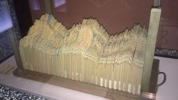
Touchscreens are all the fashion – but  any system you deploy is expected to work smoothly and intuitively – including visualisation ones. There are some company purpose-built systems for exhibitions that are far from cheap although they may work well they can also suffer from lack of agility when recreate new content. There are also simple tablet/phone software options available for touching and manipulating volumes but can have limited graphics ability.

Over the last couple of years we have collaborated informally with partners to share knowledge on open source solutions for large scale volume visualisation (say greater than 256 x 256 x 256) on a touchscreen device.

A hardware specification service has evolved where we can assist with advice and quotes for touchscreen and workstation visualisation nodes, as well as more importantly related software installation; used for exhibitions and PE. A wiki is available at:

http://tyne.dl.ac.uk/twiki/bin/view/Visualisation/ProjectsTouchTable

At Manchester, connecting through Research IT, there are now groups available to informally share equipment and expertise – and as importantly share experience in interacting with the public and other scientists – even if their research data content is often diversely different.

  • MRI medical data e.g. exploring white-matter changes within the human brain: Geoff J M Parker, Hamied Haroom, Saray Parkes (ISBE)
  • Multiple Materials Science analysis e.g. cracks, fibres and mechanical defects: Sarah-Jane Clelland, Phil Withers (MXIF)
  • Fossil and everything ancient within the Manchester Museum: Russell Garwood, Alan Brown, Campbell Price, Roy Wogelius (ICAL)

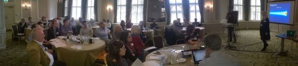
Both being asked to be available for the upcoming Presidents Office organised ‘University Celebrations of Regius Professorship’ on 25 April 2017 in the NGI.


Advertisement

Vis in the 50’s

I was having to wait for a train at Euston Station in London- and visited the Welcome Trust that is opposite, and they had an exhibition on the story of electricity.

One neat bit of 3D visualisation was near the end of the exhibition and showed a 1950s Electrical Consumption Graph:

WP_20170308_004_c

“This 3D graph, compiled by the planners of the Central Electricity Generating Board, represents the daily electrical energy consumed over a period of two years during the 1950s.”

Unfortunately, not very interactive – with the glass protection, although you can view it easily from many angles; but a few things were right in that they chose two years of data. This is a trick used today even when there is only one year’s data available – where you recommend copying the data – and was used by Florence Nightingale in her more radical circular statistical plots (of morbidity rates during the Crimean war). The problem comes with matching the ends up – between January with December in most calendar statistics. These should be continuous, but the human eye has difficulty in spotting smoothness etc. If you can not use circular plots and in this case with card indexes this would have been very difficult, then by repeating the data or here using two years of data, you can see the changes between December and January as clearly as  any other pair of neighbouring months.


Visualisation in Radiotherapy

In principle the whole medical topic of radiotherapy analysis is full of visualisation. A recent sandpit discussed Monte Carlo techniques that are critical within the radiotherapy planning / beamline construction / or just radiation safety / etc…

p20170313_001_4p40w

So where is the visualisation interests as the main need is to make these processes faster and more useful. We did pitch three small projects to look at:

  1. Solving the 1:1:1 problem may involve visualising the results immediately after compute and not storing or transmitting this.
    The 1:1:1 problem termed by radiotherapists is to model 1mm cubed, solved in 1 second with 1% accuracy for practical use.
    There will be a one-day workshop where the required (back of the envelope) 250x speed up will be discussed with UK researchers and industrial participants; from the software / hardware / and remote access skills.
  2. Sharing data discussed ways to share both code and data: an example of data / code share that worked is on zenodo (yes have used github as well).
    – Data set at: https://zenodo.org/record/16474#.WMlng_ni7Lk
    – Code for reconstruction at: https://zenodo.org/record/16539#.WMlnlvni7Lk
    – Even has a published tutorial: http://eprints.ma.man.ac.uk/2290/01/covered/MIMS_ep2015_26.pdfThese have official DOI tags and therefore are version controlled for both code and data so then can be used in papers by others – and have been,
    http://eprints.ma.man.ac.uk/2377/01/tosca_scoban.pdf
    http://www.imm.dtu.dk/~pcha/HDtomo/JCLW16.pdf
  3. A final project is looking at fractal analysis from CT to MRI analysis and considering the problem from 3D to 2D to 1D. This will enable new planning processed to occur.

More details to come. This was organised by the Advanced Radiotherapy network https://www.advanced-radiotherapy.ac.uk/ and thank them for allowing these ideas to be pitched.

There were global other issues and “Focus Where it Matters”, was a industry quote and will reuse here; so they need not just to increase speed but also to control inaccuracy and inconsistency.

Science Presentation

Had the great privileged to be one of the judges at the Manchester Grammar School, Science Fair Projects involving about 200 very enthusiastic future scientists. Each group, of three, had to design and evaluate a scientific hypothesis applied to sport, which was the theme for this year; e.g. do balls roll faster with change in temperature, does sugar consumption relate to concentration performance analysis, …

p20170306_003_5w

All did very well, but there was a good debate and points raised on how to present their work results- should they use bar charts, line graphs,and what scale ranges are important and if error outliers should be included. Interesting discussion also occurred on the quality of the graphs, produced automatically by computer software programs and how to change these.

It was good at this age that they could grasp some of the concepts that seem illusive to certain older more mature researchers when they present their work. A key lesson learnt was not to spend all your effort creating wonderful results, if the presentation and visualisation story is not given a proportional amount of time to be created.


Virtual Reality- is this just for engineers?

Visited EON Reality – UK headquarters are just up the road from Manchester city centre – very convenient as only a couple of tram stops away now.

They have always been involved with various CAVE technologies; including a fun training system shown on their portable (dismantles into two crates) system, wp_20170303_002_cw

One feature would like to consider is how their 3D software works with volume and engineering visualisation – and as discussed with the guys – how the VR headset systems produce as good an experience (if not better). An important part was the ability for the sw to display on all types of platform from tablet to large scale VR system.

EON Reality had a whole set of objects including standard curved walls and  a reverse curved perspex type screen for exhibition type spaces. To complement this there was a training academy for 30+ students each year who could understand not just the sw but the whole production life-cycle.

wp_20170303_001_cw


Vis with HoloLens and VisDish

Thanks to Ros at Digilab http://www.library.manchester.ac.uk/using-the-library/students/initiatives/digilab/ for inviting us over and showing some of her new interactive teaching and research equipment. Couple of VR/AR items and a discussion on how they would solve understanding scale and context issues for visualisation of large volume data sets.

HoloLens One of the early UK released versions of Miicrosoft HoloLens (top right image) was available and impressed due to its response and quality. The demonstrator was a game allowing you to blast holes in the walls of the room, where large robot insects would emerge and then attack you. Is a very immersive experience of Augmented Reality and worked extremely well with rapid head movements as well as correctly obscuring the right parts of the real world – so was absorbing.  Discussed science based planning exercises where;

  • Items on the floor – could be marked up as discovered; geology pointcloud mark-ups.
  • Volumes could co-locate with real objects and be cropped/clipped on demand (“shot at” metaphor)

One key failure in this version was the small field of view – as had to move your head often and setting up the glasses on your head was an issue as took a few attempts to see most of this small FOV. This in future versions will improve – just needs more compute power and resolution!

ROVR An add on movement system (top left image) – relatively cheap one – was shown by http://www.wizdish.com/ the ROVR. A simple idea so while you are standing in a slippery bowl with slippery (low friction) shoes you can use standard VR headset and slide your feet (like walking on skies without lifting your feet). This feeds back via USB forward speed and rotational direction for very intuitive movement. Played a immersive pacman running game and again experience was great – not needing the main protection bars once sussed out balance. Highly impressed as allows:

  • You can travel distances and appreciate the distance; say along a feature in a visualisation.
  • Comprehend scale and distance – for example travel to a location and see scale of fature in 3D volume set – eg cavity.

Will be tricky to move from first or third person mode for viewing  as not directly connected to the framework for context but worth watching and programming for.